Dive into the world of UI design, and learn why Figma is a game-changer! In this blog post, we’ll explore why Figma stands out among its pals like Sketch and Adobe’s XD. Plus, we’ll spill the beans on how to whip up a fun and interactive project using Figma.
Why choose Figma, you ask? Well, my journey started with Adobe XD, and while it was awesome for creating screens and prototypes, sharing designs became a bit of a puzzle. Then, in the magical land of Oktana, we switched to Sketch and InVision. But, whoa, it was like taking a step back. That’s when I waved my Figma wand and convinced our client to join the Figma party. And guess what? They loved it!
Essential elements that make the migration from Sketch to Figma easier
Here are the magic ingredients that made the migration from Sketch to Figma a breeze:
Figma’s Flexibility: It works seamlessly in your browser or as a handy app.
Team Power: Real-time collaboration made the file frenzy a thing of the past.
Prototyping Pleasure: Integrated prototyping that’s a designer’s dream.
Safety Net: Auto-save with online hosting because, well, life happens.
Code Magic: Code generation for smooth handoffs.
Steps to create a design in Figma
Now, let’s talk about putting these Figma wonders into action.
Step 1: An Idea
In my workshop, I spilled the beans on creating a fantastic app for pet owners. It all begins with a brilliant idea.
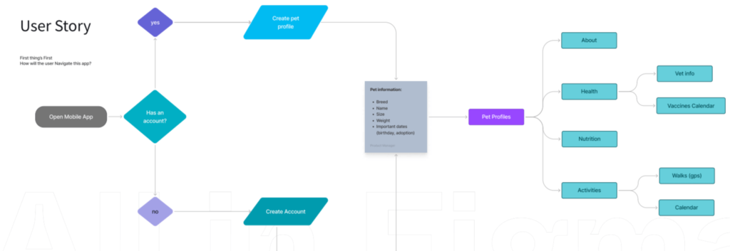
Step 2: User Story
After identifying the pet-care problem, we crafted a User Story. For our app, pet owners create an account, provide pet details, and get personalized health suggestions, vaccine tracking, walking logs, nutritional tips, and a network of fellow pet enthusiasts.
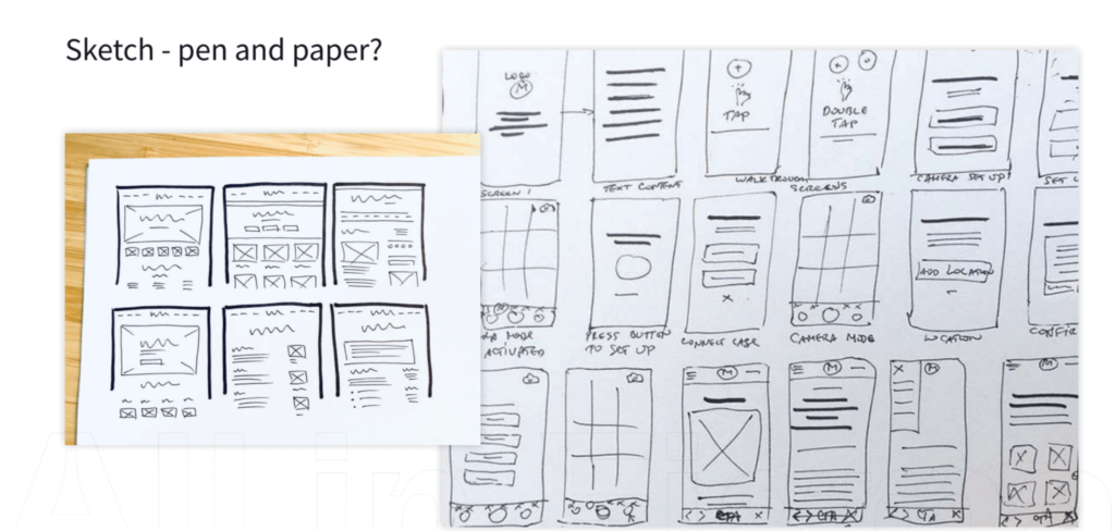
Step 3: Benchmark Ideas
But before diving into Figma, do some homework! Research similar products, grab design books, and soak in the inspiration.
The sketch phase on paper involves ideation, brainstorming, and rough conceptualization of design ideas. Sketch out layouts, user flows, and interface elements. This analog approach allows for rapid iteration and exploration of different design concepts without the constraints of digital tools.
Step 5: Wireframes in Figma
It’s Figma time! Start by creating a collaborative project for your team. Invite them to annotate and make changes. Share the early wireframes with stakeholders for a reality check, ensuring alignment with project goals and requirements from the outset.
Step 6: High Fidelity
Once the low-fidelity wireframes get the green light, dive into the high-fidelity design phase. Collaborate, iterate, and bring your idea to life. Expect this phase to be a marathon, with meticulous attention to detail and continuous refinement to achieve the desired outcome.
Step 7: Prototype
Feedback is in; changes are made – it’s prototype time! Test it with users and stakeholders. If the nods are plenty, congrats, you’ve got a winning product. Use Figma’s Dev Mode to share your design masterpiece with developers. Divide features into tickets or phases for a smooth ride to launch.
Step 8: User Testing
Utilize Figma’s interactive prototypes to simulate user interactions and gather valuable feedback on usability and functionality. Incorporate user insights to refine the design further, ensuring a user-centric approach throughout the development process.
Step 9: Handoff to Devs – Dev Mode
Transition from design to development by providing developers access to design specifications, assets, and code snippets directly within the platform. Streamline the handoff process and facilitate clear communication between designers and developers, ensuring a smooth transition from design concepts to fully realized products.
Migrating from Sketch to Figma brings many benefits that streamline the design process and enhance collaboration. Figma’s flexibility, real-time collaboration features, integrated prototyping capabilities, auto-save functionality, and code generation tools make it a compelling choice for designers and teams.
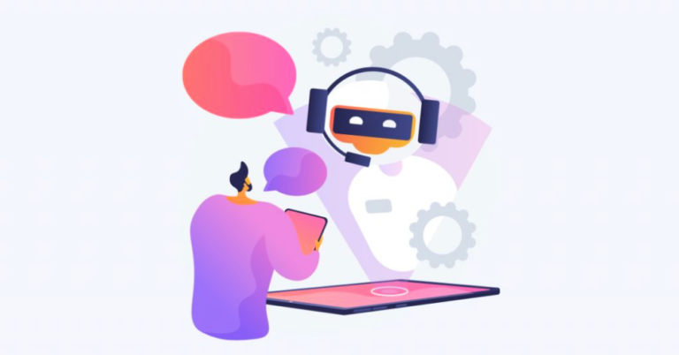
In today’s highly competitive business landscape, companies constantly seek innovative ways to enhance their sales processes and provide exceptional customer experiences. Two powerful tools that have gained immense popularity in recent years are ChatGPT and Salesforce. ChatGPT, an AI-based language model, and Salesforce, a robust customer relationship management (CRM) platform, can work synergistically to revolutionize sales and take customer interactions to the next level. In this blog post, we will explore the benefits of integrating ChatGPT with Salesforce and delve into the various use cases that can maximize your sales efforts.
Personalized Customer Interactions:
One of the key advantages of combining ChatGPT and Salesforce is the ability to deliver highly personalized customer interactions. By integrating ChatGPT with Salesforce’s customer data, you can access detailed information about each customer, including their purchase history, preferences, and behavior patterns. This valuable data empowers your chatbots to provide tailored recommendations, answer queries, and offer relevant products or services. The result is a seamless, personalized customer experience that fosters trust and enhances satisfaction.
24/7 Availability:
Salesforce-powered chatbots fueled by ChatGPT enable businesses to extend their availability beyond traditional working hours. With automated chat capabilities, customers can engage with your brand anytime, anywhere. Whether it’s seeking product information, resolving issues, or placing orders, your chatbot can provide real-time assistance, reducing response times and ensuring round-the-clock support. This continuous availability strengthens customer loyalty and enhances the overall sales process.
Lead Generation and Qualification:
Integrating ChatGPT with Salesforce allows you to optimize lead generation and qualification processes. Chatbots can engage potential customers in conversations, gathering valuable data and qualifying leads based on predefined criteria. By seamlessly transferring qualified leads to Salesforce, your sales team can focus their efforts on high-priority prospects, increasing efficiency and conversion rates. The integration also enables lead nurturing and follow-up, ensuring a consistent and streamlined sales pipeline.
Real-time Sales Support:
ChatGPT and Salesforce integration empowers sales teams with real-time support and information. Sales representatives can leverage the chatbot’s capabilities to access product details, pricing information, and even real-time inventory updates. This immediate access to critical data allows sales professionals to provide accurate and up-to-date information to customers, making their interactions more impactful. The integration streamlines the sales process, reduces errors, and enhances productivity.
Embracing these technologies enables companies to stay ahead of the competition, nurture customer relationships, and drive revenue growth. Explore the possibilities of ChatGPT and Salesforce integration, and unlock the full potential of your sales process.
Image suggestion: An image showcasing a seamless connection between ChatGPT and Salesforce, symbolizing the integration’s potential and impact on sales.
The seamless integration of ChatGPT and Salesforce presents a significant opportunity for businesses to enhance their sales processes and deliver exceptional customer experiences. By ensuring that the chatbot conversations feel natural and undetectable, leveraging customer data for personalization, establishing a dynamic connection with Salesforce, and automating lead qualification, companies can achieve impressive results. Embrace the power of this integration to stay ahead of the competition, nurture customer relationships, and drive sales growth, all while maintaining an undetectable and authentic conversational experience.
The use of appropriate techniques and responsible AI practices is essential to maintain ethical standards and ensure that customers are aware when interacting with a chatbot rather than a human representative. Transparency about the nature of the interaction is crucial for building trust and maintaining ethical guidelines.
How to develop a design thinking and innovation strategy in digital product development.
Nowadays designers look forward to providing shapes, forms, and uses that connect ideas with key functionality and contribute to social changes, taking advantage of technology benefits that we need in UX/UI, or experience, development. They optimize the results using design and critical thinking as well as integrated tools and strategies for the construction of the design of those digital products.
George Eastman, founder of Eastman Kodak Company in 1892 said, “dreams are limited only by imagination.” The creative problem has a solving system if you’re able to pass that limitation.
Today, design involves technology to solve more complex usability problems. The amount of data required to solve problems has increased rapidly in this century. The design problem-solving process may need larger teams with more diverse members from different fields. Teams need to combine skills in order to solve the issue to bring design and innovation solutions together.
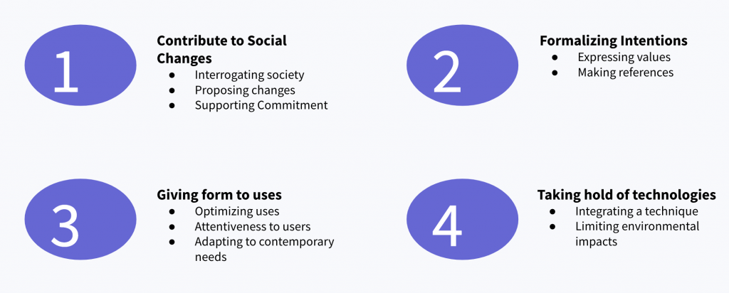
The product design objective process
The product design objective process is divided into 4 steps.
Contribute to social changes: This means knowing the society where you want to put a product for use. Proposing changes and supporting commitment in between teams, clients, users, and the tools you’re using.
Formalizing intentions: Where you add value connected to the reference of the society; making pieces that can be a more equal or balanced product.
Giving form to uses: Making a better UI/UX system you optimize the efficiency and interfaces. Adapting uses to contemporary needs
Taking hold of technologies: Integrating techniques and technologies while limiting environmental impact.
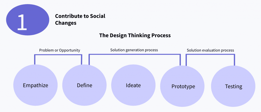
1. Contribute to social changes
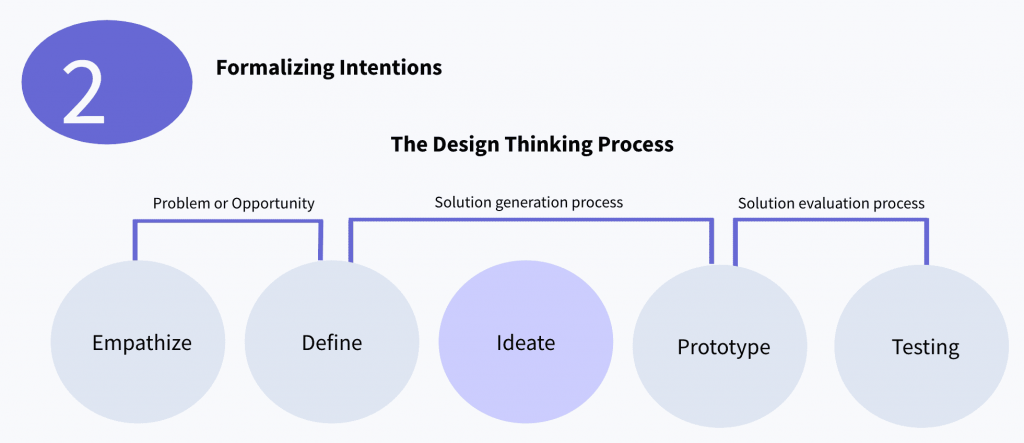
Problem or opportunity
Emphasize: Researching and interrogating society and user needs.
Define: Defining those elements and propose changes according to users’ and society needs. Creating a design brief, noting the design parameters.
Solution generation process
Define: Part of the solution generation process because through the definition you go to the ideation stage where you create ideas and select better design parameters for innovative opportunities and development.
Ideate: Create ideas and select better design parameters for innovative opportunities development.
Prototyping: Start creating solutions more tangibly. Visualizing and storytelling.
Solution evaluation process
Prototyping: Interactive design and prototyping.
Testing: Validating the solution, refining results, and incorporating constructive feedback.
This is a process of emphasizing research and ideation which helps designers move to prototyping product development. It also allows you to have a very clear and defined ideation process.
2. Formalizing intentions in the design thinking process
When you are in the ideation step, as mentioned above, you create ideas and select better design parameters for innovative opportunities development.
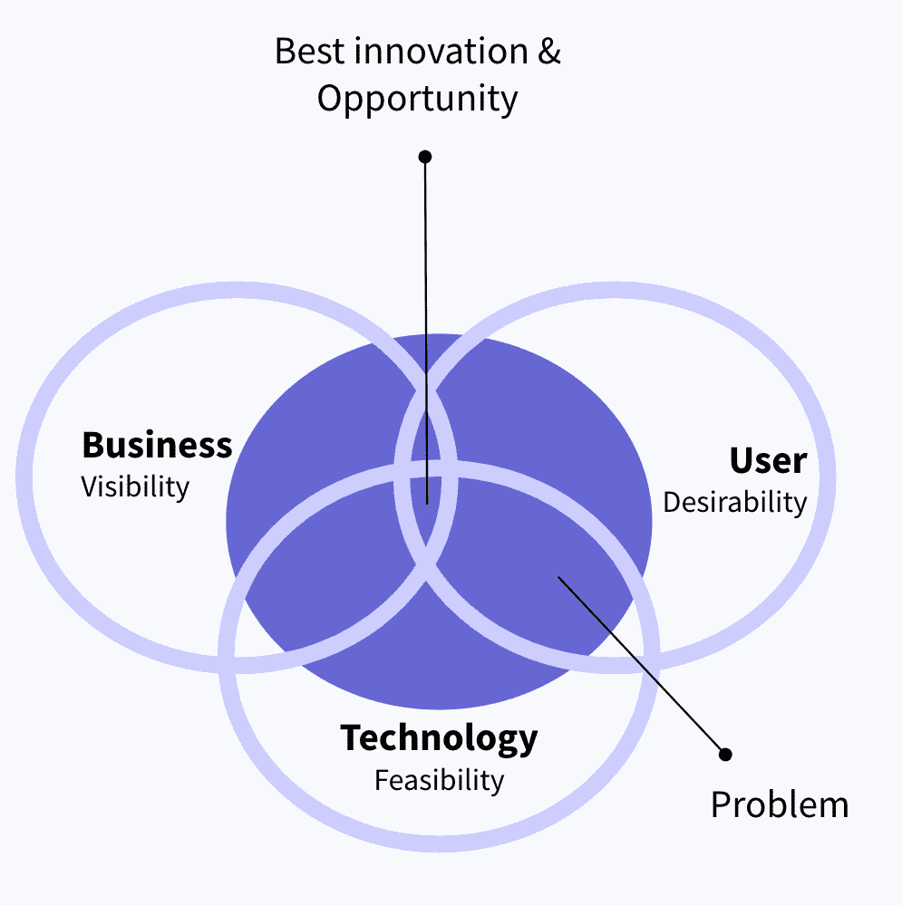
Start with a problem, analyzing three elements:
Technology: The main element; it gives you the tools to address this problem or opportunity
Business: Business is focused on viability, making sure it is possible on the business side
User. Last, but not least there is the user and the desirability
The design process begins with establishing a connection and understanding of the end user and the market in which the product will be positioned. Start by considering two perspectives:
Feasibility: Focused on technologies and tools they can use to address a need or opportunity
Viability: Focused on a given business strategy of a financial target
While these are important, they ignore desirability, or who the user is, what they care about, and why. Design thinking is often referred to as human-centered design because designers always start their approach by looking at the people and their needs before considering feasibility and viability. Merging these three elements you will find the best opportunity in the market.
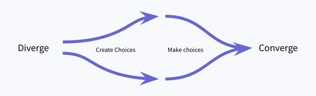
The divergent, convergent ideation process
Diverge to explore new possibilities:
Gather a wide range of stimulus and ideas.
Use a deck of creative prompting cards.
Brainstorm with colleagues who aren’t working on the project.
Document every idea.
Converge to focus on the best route forward
Refine ideas and recognize patterns.
Establish evaluation criteria.
Force yourself to answer if you had to do it now.
Prioritize.
Sketch ways of structuring your problem.
Give it some space.
Consider: What concept is most likely to resonate with our consumers? Which project approach is most likely to meet our team’s goals? Do certain ideas align more with company strategy?
Explore a range of options before selecting the best path forward
The divergent-convergent process is at the heart of all projects.
The usability of this structure is that it applies in any time frame of the project.
The main point is to recognize which behavior you might need at any moment.
You have too many options and you’ve been looking for the main direction.
Consider: Projects that create new value have periods of uninhibited exploration followed by critical organization and refinement. You could use it in an afternoon meeting, several times in a one-week sprint, or routinely across a two-month project. Are you stuck in a rut on the project? Then explore new options through divergent thinking. Force yourself to edit and prioritize so you can work on something more specific.
One great example is the Sony PlayStation 5. It is a combination of all the experiences they had as a product, in terms of industrial design, digital prod dev, and UX/UI dev, that delivers a product that simplifies user interaction.
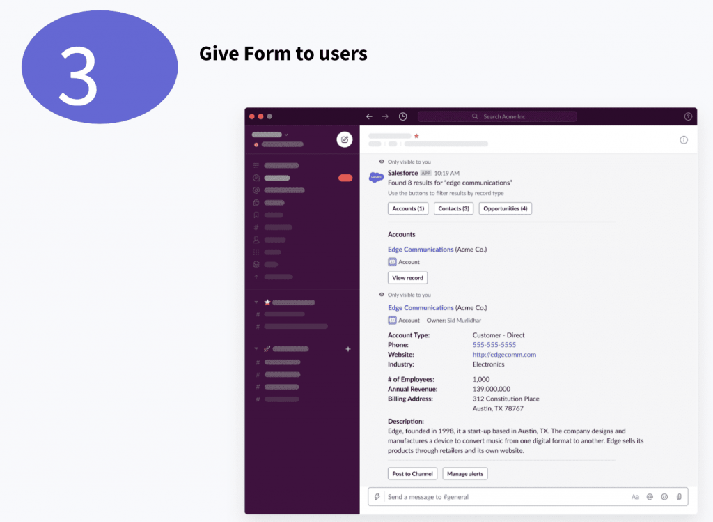
3. Give form to users
Optimizing uses according to functionalities, performance and efficiency. This is something that needs to be merged in the user interaction and UX development. It is also important to consider users in the design process adapting to them and making it more accessible.
A great example is the integration of Slack with Salesforce. They considered the end-user in the design process, adapting to that end user’s needs and making it more accessible. Making interaction easier.
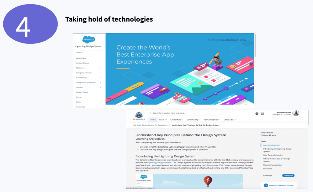
4. Taking hold of technologies
In this step, you use technologies as an advantage for the development of products.
As an example, Salesforce and Salesforce Trailhead offer integration of techniques and technology development. They improved the existing functionality and converted intangible ideas to tangible solutions, simplifying access to technology.
Details that matter in UX/UI development and the design innovation process:
UX is not only UI, the interface is part of the experience.
Know your audience, you are not the main user of the product.
Adapt the designs for short attention spans.
The design simplifies the UX/UI.
Adapt the design process according to the product you are designing.
Ideate and prototype before constructing the final product.
Use real content while you are designing.
Make a simple and consistent design layout.
Recognize overall patterns and impact in the design process.
Make design accessible and inclusive.
Don’t try to solve a problem by yourself or everything at once.
UX (user experience) design has recently become more widely recognized. Many of us have heard the term UX used, but what does it mean? What’s the goal of a UX designer? In this article, we’ll answer these questions, share some history, and discuss how you can get started with UX design.
TheInteraction Design Foundation, a pioneer in training UX designers around the world, said that UX design is defined as: “A design process used to create products that have relevant experience for users. This involves brand, design, usability, and function aspects.”
Usability and function are the essential elements of UX Design. UX has a strong relationship with users, technology, and business. In a specific digital product, it’s important that the UX designer understand the limitations of the technologies that are going to use. For example, if you are developing a responsive web project with HTML and Javascript, as a designer you need to understand the basic limitations of the technology. That way, designers avoid creating features that aren’t supported. It doesn’t mean that a UX designer needs to know about code, but they must know the principal characteristics and limitations of each technology.
Also, a designer has to know the business model of the product. Many people think that a UX designer always has to create a beautiful and innovative product, but the reality is that sometimes creating a common design is necessary to achieve the goals of the business.
User Design History
Many theories exist about the beginning of UX Design. Some say that the industrial revolution initiated the first debates about the relationship between a machine and its user.
But actually, Apple was the first company to apply the concept of Human Interaction Design. What does this mean? The understanding of the interaction between humans and any aspects of a technological device. Like computer mouse, keyboard, interface is known as Human Interaction Design. For the beginning of UX design, this is the best starting point.
In fact, in 1995 the engineer Don Norman (a pioneer of this discipline) applied this theory while he was leading a design team at Apple. He began using this concept and calling himself a UX designer. In one of his books The Design of Everyday Things (a must-read for every UX designer). He analyzes the design of all the objects around us. He delves into the concept of design and explains the importance of the communication between an object and its user, and how we should improve it. All of this is related to the digital world with things like apps, websites, software, and more.
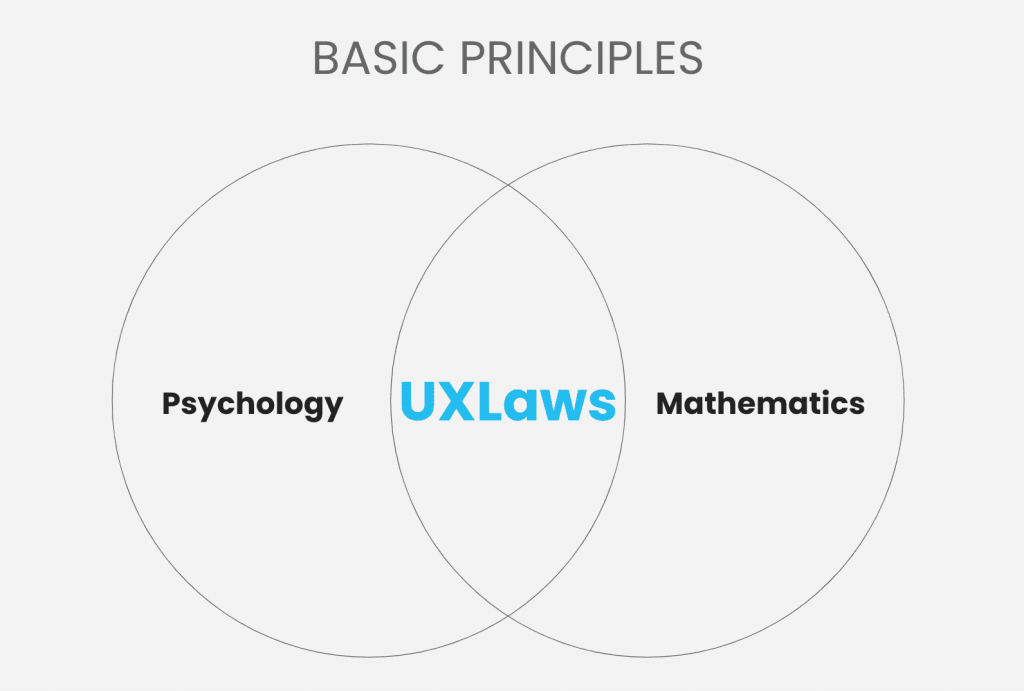
How do I get started with UX design?
First, you must understand the main principles of design, known as the ‘Laws of design’. Psychology and mathematics backed these laws. The creator, Jon Yablonski, affirms that to have a valid foundation for every UX design, it must apply psychology and math fundamentals to build experiences that adapt to how users perceive and process digital interfaces.
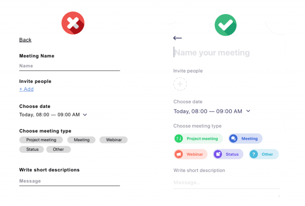
“The time it takes to make a decision increases with the number and complexity of choices.”
Hick’s Law is based on a mathematical model that says that the time to make a decision increases as the number of options grows. Very obvious, right?
Specifically, the reality is that when we apply the mathematical model to UX, we’re talking about a fraction of a second between making one decision and another. So, we have to be very careful about the number of options we provide.
Example: The image on the left looks like a clean UI. However, compared with the image on the right, the number of options could be greatly reduced and could visually help the users to guide themselves. The option in the middle helps the user decide immediately. In any case, reducing the number of options also reduces the time of choosing and, as a result, encourages users to select the most profitable and beneficial option for the business.
It is very important to understand a company’s business model, the design objectives must be aligned with the commercial objectives. In the same way, there must be a connection between the business model and the UX model.
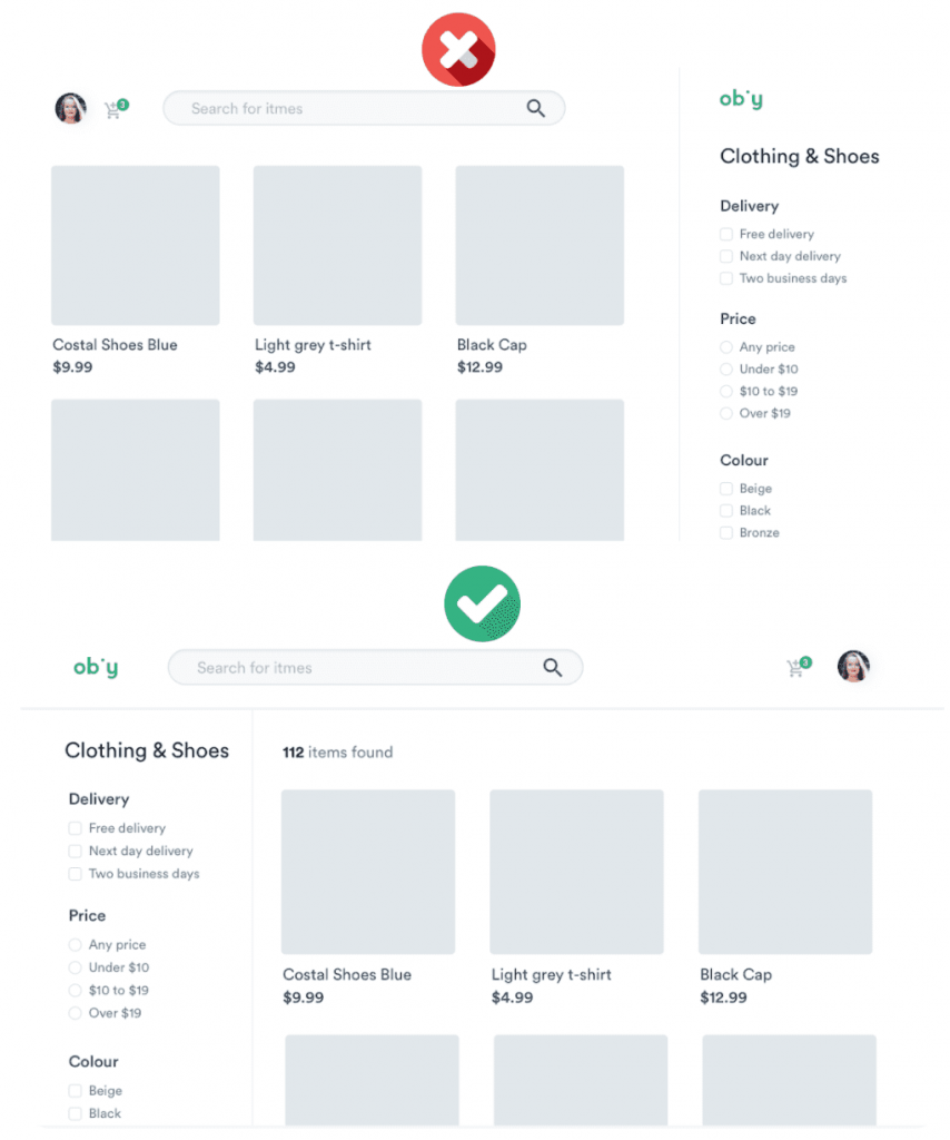
“Users spend most of their time on other sites. This means that users prefer your site to work the same way as all the other sites they already know.”
For example, in this sample e-commerce interface, it looks like everything is fine and clean, but the reality is that certain things are messy.
The user has already learned a certain journey from their time on other web sites. You don’t want to make customers think about how your site works. There are certain human behaviors that we unconsciously learn and acquire. Certainly, when someone shows us something outside of what we have already learned, we feel rejection. That is why the design systems promote certain design patterns that we use every day, such as Google, Facebook, Instagram, and more
The goal of UX design is to optimize things. If the user already knows a certain pattern, it must be reused.
“Users often perceive aesthetically pleasing design as design that’s more usable.”
This law is based on human behavior. As we see, the design on the left is neutral and hierarchies are used well. If we compare it with the second design, we see the application of colors and a much higher level of detail, aesthetically it is perceived more pleasantly. Humans tend to recognize this design as more usable. As a result, a design may be cute but it doesn’t fulfill all the functionalities.
This example highlights the importance of the UI because it helps the user to interact more easily and pleasantly, as a result, the experience improves.
UX has a bit of psychology and mathematics, this helps designers to establish which design is the most appropriate. You don’t only have to care about aesthetics, there are many other things that are a part of good UX design. Also, some mathematical models support these behaviors, so there are specific ways in which certain interfaces and experiences must be developed.
Now we have twenty laws recently added. I’m sure this will increase, you can check out all the laws here.
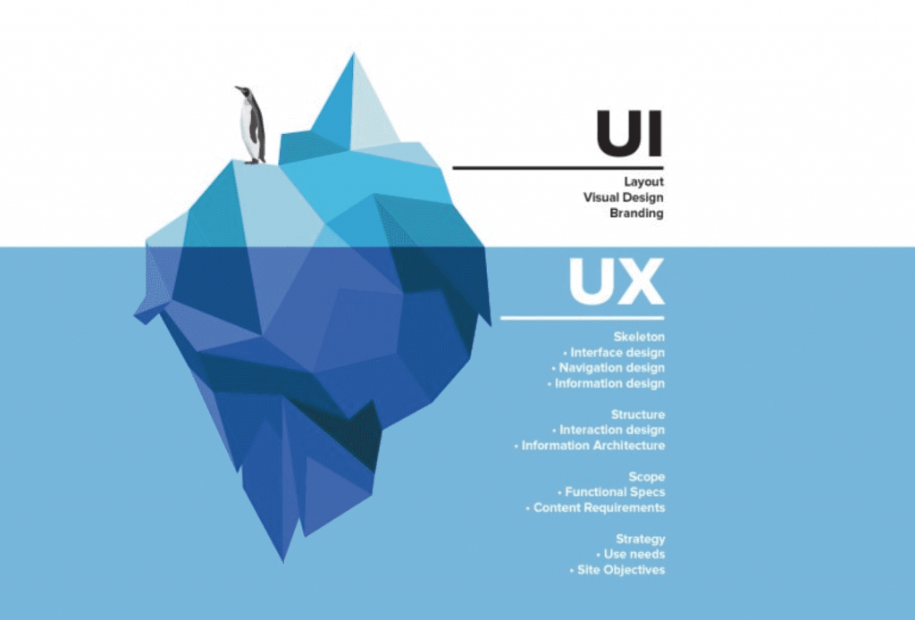
What is the difference between UX and UI?
UI is inside UX, with UX being the umbrella of everything. The fundamental piece in the UI. Both must be connected although is much easier to understand when they are separated.
Some differences:
User Interface (what the end-user perceives)
Branding
Colors and typography
Graphics and illustrations
UI components: buttons, inputs, etc.
Layout
User Experience (this has to be solid, that’s the only way the UI would be functional and provide a good user experience)
Definition of the problem and the needs: Detect what the problems and the main needs are. If you don’t understand the problem you will never find a solution.
Research: Research is done regarding the product, investigate the type of user, and more. It varies for each project.
Usability test: It’s very important to make usability tests. A designer must know if the product is usable or not. For example it’s important to be aware that the user can finish the process in a particular amount of time. Or certain parts of it will get you frustrated.
Information architecture: Locate all the content and ideas to generate a hierarchy and order the content. This helps the user to find things much easier.
User Flow: Design all the flows through which the user passes (this part is very important).
User Cases: Each person will have a different experience, depending on the use case. Design each experience based on different types of profile
Currently, a designer works with both UX and UI. But if we talk specifically about UX designers, they don’t necessarily have to know how to design. You need to know how to design to be able to transfer all that experience to UI, that’s the only way to have skills that can be used more generally.
Conclusion
Design is everywhere. So it seems simple but it is complex as it evolves through the digital age, making it challenging. Today we have twenty laws and overtime more concepts and insights will appear and this will continue growing. On the positive side, the design principles will always be maintained.
So as designers we have to provide solutions, that is the most important thing.
If you’ve made it this far, thanks for reading! Read more interesting articles here.
The Web is fundamentally designed to work for all people, whatever their hardware, software, language, location, or ability. We meet this goal when we create websites that are accessible to people with a diverse range of hearing, movement, sight, and cognitive ability.
“The power of the Web is in its universality.
Access by everyone regardless of disability is an essential aspect.”
Tim Berners-Lee, W3C Director and inventor of the World Wide Web
When websites, applications, technologies or tools are badly designed, they can create barriers that exclude people from using the Web.
Who Benefits from Website Accessibility?
Website accessibility is useful for everyone and essential for people with different abilities.
The four principles of the Web Content Accessibility Guidelines
Perceivable: The information cannot be invisible to all of a user’s senses.
Operable: The interface cannot require interaction that a user cannot perform.
Understandable: The content or operation cannot be beyond the user’s understanding.
Robust: Users must be able to access the content using a wide variety of user agents, including assistive technologies.
Here are some tips to put into practice, to build inclusive digital products:
1. Design for users on the autistic spectrum
Try to use simple colors and avoid high contrasting ones.
Use simple sentences.
Make buttons descriptive.
Build simple and consistent layouts.
2. Design for users of screen readers
Describe images and provide transcripts for video.
Follow a linear logical layout.
Structure content using HTML5 <h1> <nav> <label>
Build for keyboard use only.
Write descriptive links and headings.
3. Design for users with low vision
Check Text Contrast: To ensure that most users can see and read your content they should have at least a color ratio of 4.5:1 or higher for regular-sized text, 3:1 for icons, and large text (24px and above or 18px bolded text).
Use Color and Iconography Wisely: Don’t use color as the only visual means of conveying information. Differentiate elements with a second indicator, such as informational text, icons, textures, or thicker borders. Ensure that text and informational icons have enough color contrast.
4. Design for users with dyslexia
Use images and diagrams to support the text.
Align text to the left and keep a consistent layout.
Consider producing materials in other formats (for example audio or video).
Keep content short, clear, and simple.
Let users change the contrast between background and text.
5. Design for users with physical or motor disabilities
Make large clickable actions.
Give clickable elements space.
Design for keyboard or speech only use.
Design with mobile and touchscreen in mind.
Provide shortcuts.
6. Design for users who are deaf or hard of hearing
Write in plain language.
Use subtitles or provide transcripts for videos.
Use a linear, logical layout.
Break up content with subheadings, images, and videos.
Let users ask for their preferred communication support when booking appointments.
7. Design for users with anxiety
Give users enough time to complete an action.
Explain what will happen after completing a service.
Make important information clear.
Give users the support they need to complete a service.
Let users check their answers before they submit them.
As you can see, if you follow these basic tips you can improve the overall user experience. Accessible Design can enhance your brand, drive innovation, and extend your market reach.
Here I share some useful tools for Accessibility Testing and interest resources about this topic:
Let’s make the world a better place and let’s begin making digital products inclusive. ?
Andrea is one of our stellar UI/UX designers. Find out more about our team of designers here, or take a look at other interesting articles in our blog.
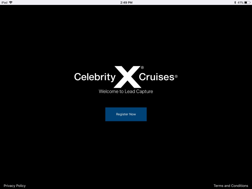
At Oktana, we’re heavily invested in the world of mobile app development. We believe that building new mobile tools that let our customers interact with their Salesforce instance out in the field is essential to the future of the platform. One of the most recent projects that allowed us to utilize our Mobile development skills is our project with Royal Caribbean for their Celebrity Cruises premium brand.
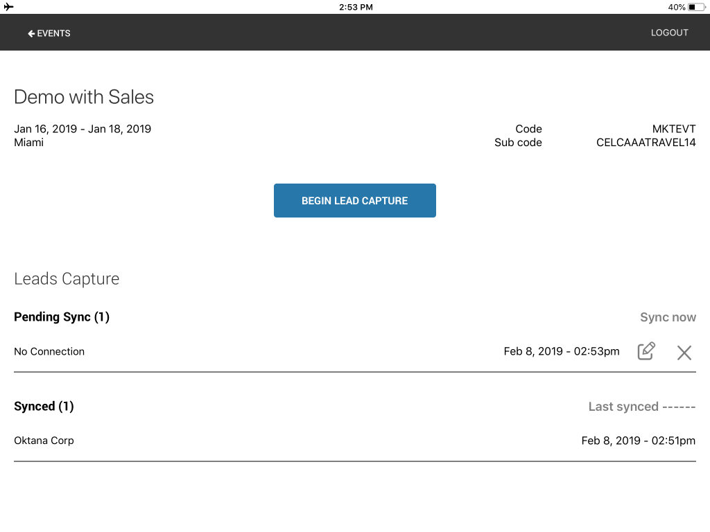
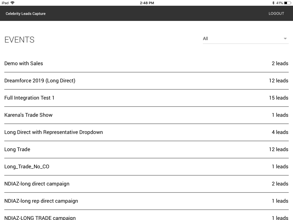
Celebrity Cruises participates in a number of large conferences and expos every year where their sales team is out in the field talking to potential clients and customers. They needed a way to easily gather data from the people they met for giveaways and potential sales leads. Additionally, this needed to be a tool that would allow them to gather the data while offline and then sync with Salesforce when they reconnected later because while moving around at conferences they can’t count on network connectivity.
Oktana was brought in to build an iPad app that would accomplish these goals. The app was built and designed internally by us. We designed an app that was slick and would be impressive looking so that when potential customers saw it on the floor it would look like something you would expect from a premium brand like Celebrity Cruises. We needed to make sure it met all of the client’s needs from beginning to end which included both the technical aspects and the app’s appearance.
What tools did we use to accomplish this task? We built the app using Salesforce DX along with Forcereact and the Salesforce Mobile SDK. The app also talks directly to the Salesforce Sales and Marketing Clouds. When a member of the sales team at Celebrity Cruises is preparing to go out to the floor of a show or conference they simply need to launch the app and select the Salesforce campaign the leads will be entered into. Then when they disconnect from the network the app will store all their leads locally and when they reconnect to the network at the end of the day it will sync them with the proper campaign. Additionally, when leads are entered the team member has the option to edit them for errors or even delete them before they sync to keep their campaign list clean.
This project was a perfect fit for us because it allowed us to utilize our experience in mobile development and Salesforce to make a unique tool for our client. The key elements to highlight for this project include:
While we have been working on this project for Celebrity Cruises we have also been helping Royal Caribbean with ensuring their tools meet GDPR requirements in the EU. We created tools to ensure collected data could be anonymized upon request. Royal Caribbean has been a great partner for us at Oktana and we believe this app was a great showcase of our skills in both Salesforce and Mobile development.
If you are a Salesforce partner looking to partner with experts to help you provide the best custom app development solutions to your clients Contact us. Our team will give you more information about these services.
Everyone at Oktana is the best of the best at what they do and the incredible people that make up the Demos and Proof of Concepts team lead by Gonzalo is the perfect example of that. Whether it’s a Salesforce, mobile, or web project the team works hard to make our client’s dreams and ideas and make them a reality. The needs of our clients always come first and as such the team has developed into an extremely agile machine that is capable of producing and iterating on projects quickly while responding to new and changing requests.
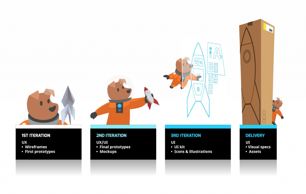
The Demos and Proof of Concepts team’s role are to help our clients work through the entire prototyping process. First, we bring on all stakeholders and map out what the client’s goals and vision for the project are. The team is extremely adaptable and capable of discussing tasks at a very high level regardless of how fleshed out the idea is. Once all these ideas are captured the design team here at Oktana gets to work on designing the prototype. The design process here is highly iterative as we want to make sure our work is aligning with all of our client needs.
Once the design has been completed, the assets are then passed on to the engineering team. The engineering team then takes pre-built templates and reworks them into a working prototype for the project at hand. They continue to iterate on the concept with the client to ensure that it meets their needs. Once this process is completed the client will either decide to move forward on the development of the full product or not. If they opt not to move forward all code is then scrapped and the team moves on to its next project.
The Demos and Proof of Concepts team does incredible work for our clients with very little notice. They’ve built demos and prototypes that have been used for presentations in front of thousands of people at major conferences. If you’re ever in need of a demo or prototype then our team is here for you.
If you are a Salesforce partner looking to partner with experts to help you provide the best custom app development solutions to your clients Contact us. Our team will give you more information about these services.