About the client and their service
BrightPlan is a service that allows employers to improve their employees’ financial well-being through financial advisors and their digital platform. Within the latter, users can review their spending, have a detailed view of their net worth, generate budgets through an AI that looks into their past behavior, create short and long-term goals, among other things that bring their finances to life.
What was our challenge?
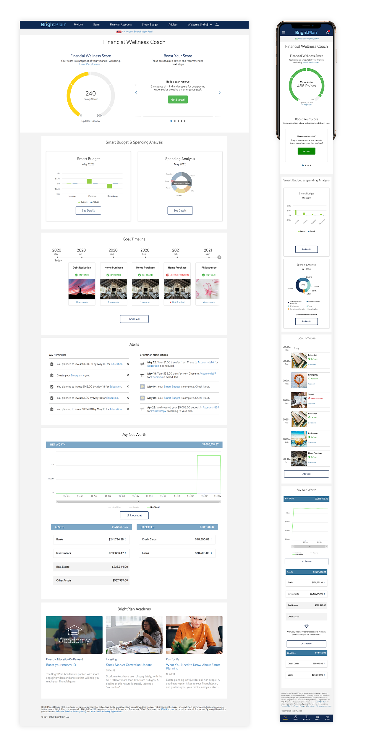
Through several informal interviews, as well as from potential customers in demos, BrightPlan got feedback that their main page was too long, especially on mobile and it didn’t give as much instant value as they would expect. So, our goal was to redesign the main page, making it shorter, while bringing even more value to our customers at first glance
How did we tackle this problem?
Analysis of the BrightPlan app
The first thing we did was an analysis of BrightPlan’s main page and documented the shortcomings we encountered:
- The page was extremely long, mainly due to its centered layout and it wasn’t designed with a mobile-first approach, so it was even longer on such devices.
- The features showcased weren’t very dynamic, so it didn’t give users a reason to enter the app on a daily basis.
- Academy, a key feature within the app, was at the bottom of the page and really difficult to get to.
Benchmark Mood board
Then we decided to review other applications. What were common patterns and practices within financial apps? Our main insight here was how they use dashboards to showcase main insights to their customers.
Ideation & early wireframes
After several discussions with the team, we decided we would take a dashboard approach to our landing page since it brings the most important elements up front and makes the users focus on what’s really important. But then we needed to decide, what kind of dashboard would it be? Would it have fixed-size widgets? Would some be bigger than others? How will we prioritize what’s relevant to our users?
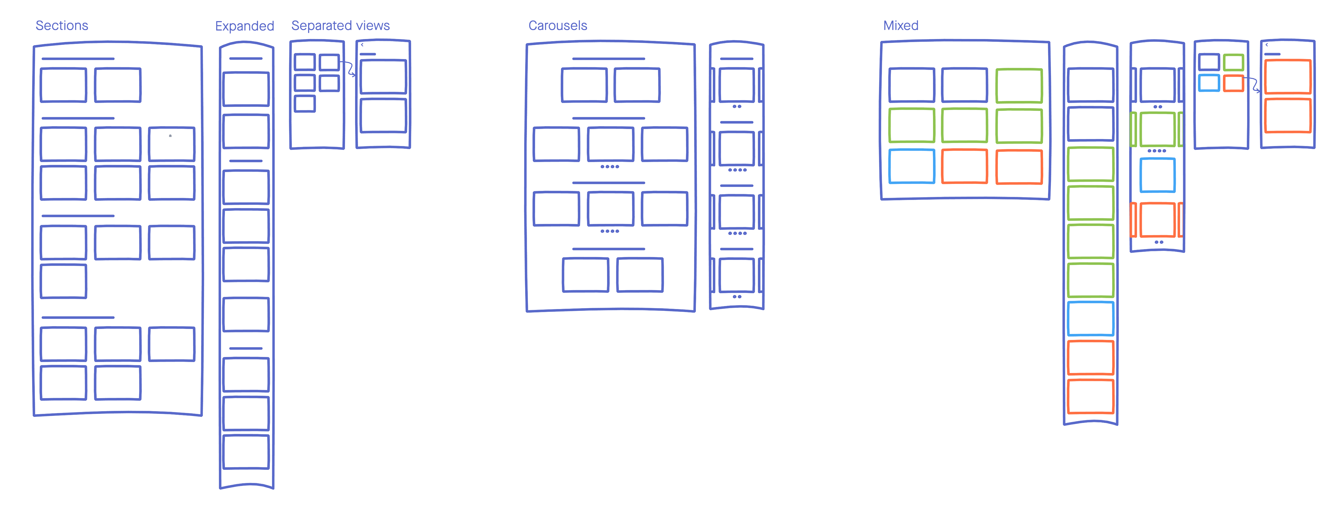
We did several explorations on layout, but before making a determination, we decided to do user interviews to get a clearer view of what’s important to them.
User Interviews
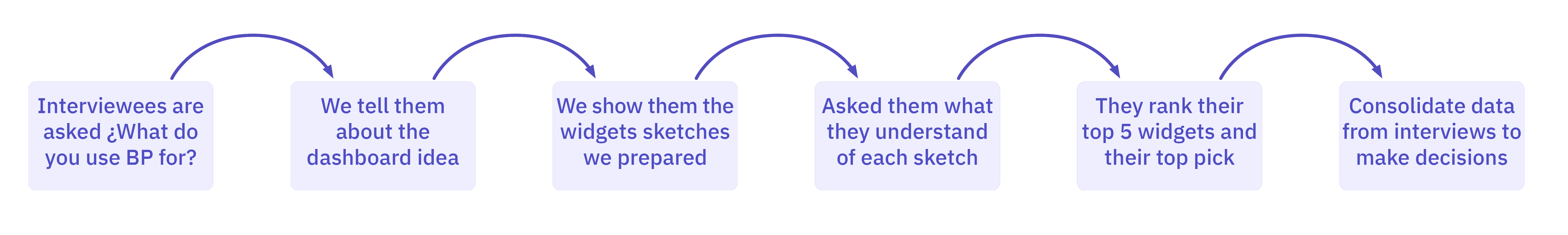
Instead of going to users and just asking them about our platform, we decided to create more sketches, but this time for the widgets themselves, how they will look, and what kind of information they will show. We created a sketch for every feature within our platform and also developed sketches of ideas for widgets we thought would be useful so we could validate them with our users.
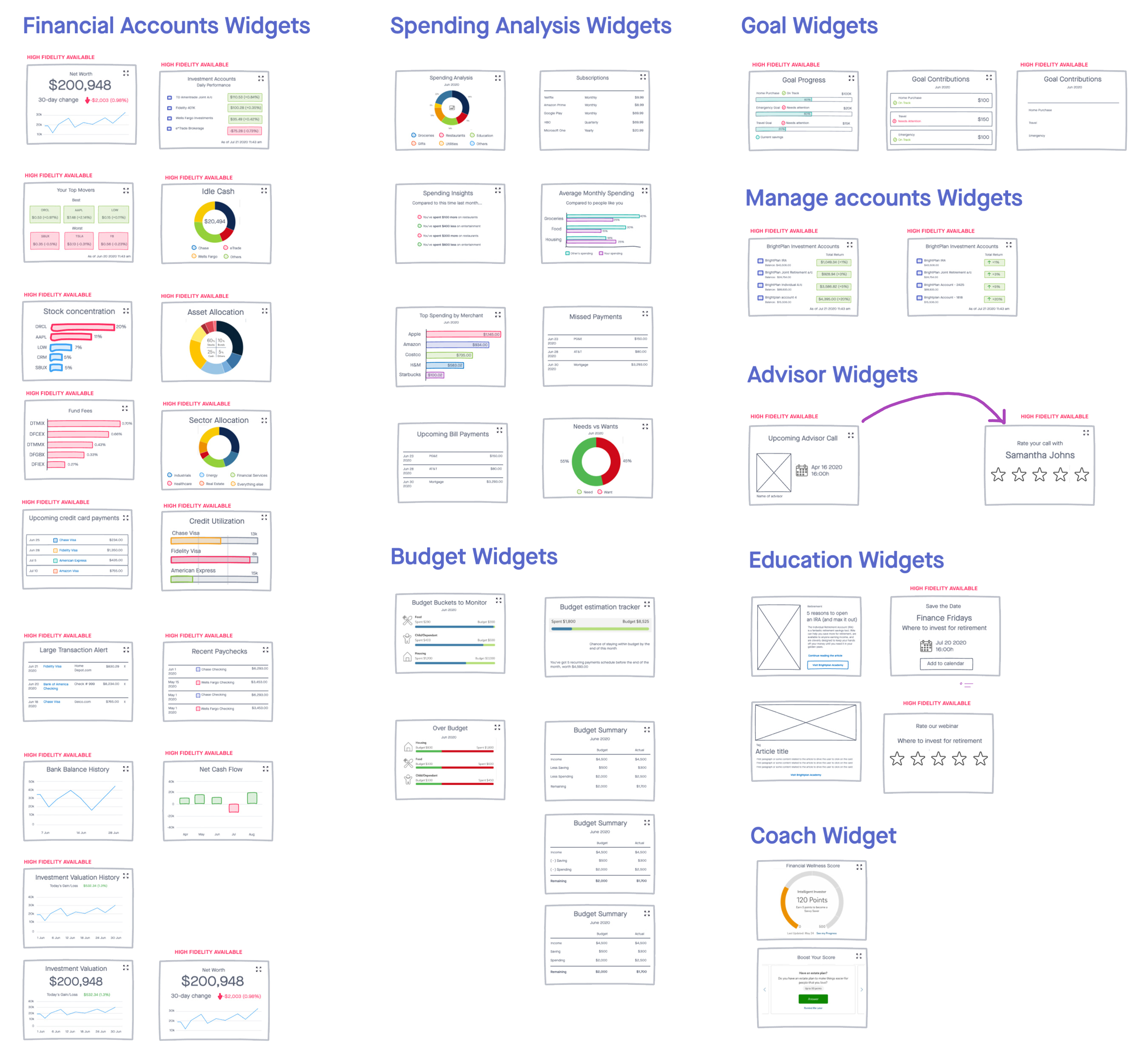
Once we had the sketches, we conducted several user interviews with customers. We asked about their experience with the platform, which are the main features they use on BrightPlan and showed them sketches of the widgets to see what they thought and to name their top five. Our main insights were:
- Different users, different needs. Some customers use BrightPlan to review their goals, others review their spending, while others focus mainly on their accounts.
- Some users suggested they want a landing page with more insights, according to their needs, rather than a set standard.
- When shown the dashboard, all of them seemed excited, but when asked about which ones were their top 5, they all gave different answers.
- Some of the sketches were marked as useful, while others were either not clear on what they were showing or not useful at all.
Design Phase
With those insights and our goals in mind, we decided that:
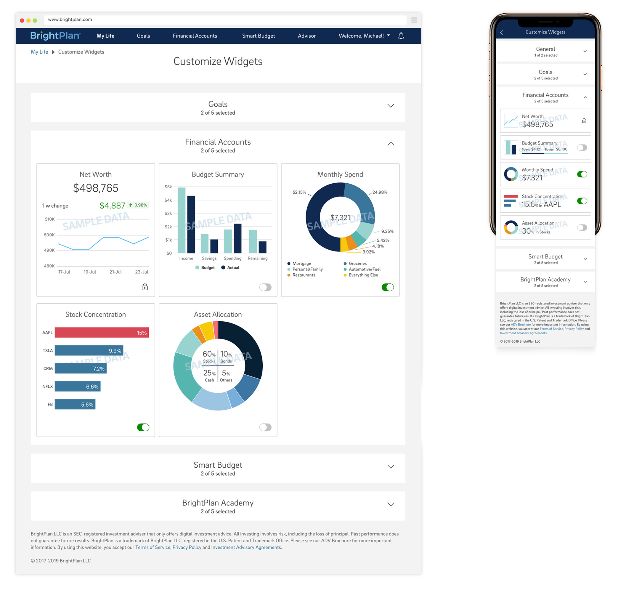
- Our dashboard will be customizable to suit any user needs.
- We will allow users to switch between old and new views to get metrics on adoption.
- Our widgets will all be the same size as the most meaningful insight varies depending on the customers’ changing needs.
- Although customizable, the top three widgets will be assigned by BrightPlan based on business needs.
- They need to only showcase the most important data, especially on mobile.
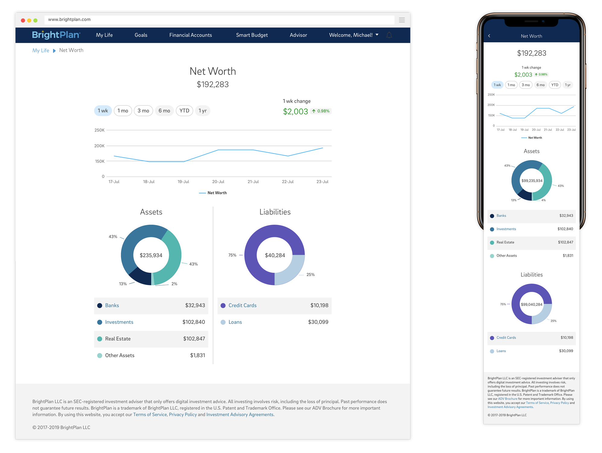
- Once clicked or tapped, the user goes to a full page where more detailed data from the widget is displayed.
With these in mind, our final design followed Brightplan’s design system, so besides the widgets themselves, most components and elements were already pre-built.
We also created the settings page, where users can go to customize their main page, in case they want to add a new widget or take out one that doesn’t have any value to them.
And for each of these widgets, we created a brand-new page with all their detailed information.
The results
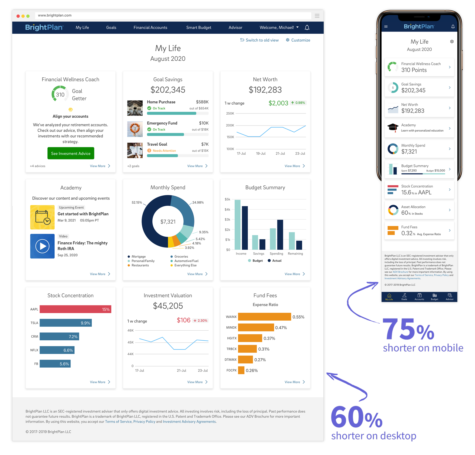
- Desktop page 60% shorter and mobile 75%, both providing more relevant content to the user.
- 99% Adoption by users of the application.
- One-click access to different sections of the application that previously required multiple clicks and navigation.
Read more about Oktana UI/UX services and request a quote.